BFC
最近在准备面试,真巧一次面试中也涉及到 BFC 概念,当然我回答:不知道。但其实我们平时的开发中,却时刻在利用 BFC 特性在处理样式问题。
BFC 又称 Block Formatting Context (块状格式化上下文)
MDN 解释:
A block formatting context is a part of a visual CSS rendering of a web page. It’s the region in which the layout of block boxes occurs and in which floats interact with other elements.
好吧,我看了这段解释也是似懂非懂。
大概意思是:BFC 是 css 渲染页面环节中的一部分。在块级盒子布局的范围中出现,并且它也影响着浮动元素和其他元素。
哪些方式会创建 BFC ?
通过以下方式,能创建一个 BFC 规范的布局(根据我熟悉的程度简单划分几类,如下):
平时常用
- 根元素是 html
- 设置 float 的元素(脱离文档流)
- position: absolute | fixed(脱离文档流)
- block 元素设置 overflow (非 visible,内容不被加工处理,直接显示)
- display: inline-block
- display: flex | inline-flex
- display: grid | inline-grid
不常用(table 系)
- display: table-cell(table 单元格 cell 默认为此样式)
- display: table-caption(table caption 默认为此样式)
- display: table, table-row, table-row-group, table-header-group, table-footer-group
不常用
- display: flow-root
- 设置 contain: layout, content, paint 的元素
- column-count or column-width 不为 auto 的元素(包括 column-count: 1)
- column-span: all
实际应用举例(摘自 MDN)
通过几个例子,感性的理解下 BFC 在实际场景中的作用:
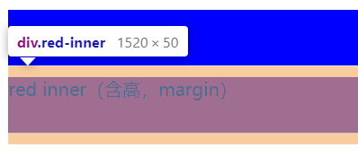
margin 塌陷
首先我们知道当在相邻的块级元素的 margin 会发生合并现象(称为:外边距折叠)
通常会发生在:相邻元素,父子元素 margin 接触处,或者一个空的块级元素。
1 | <style> |
注意到两个 div 之间的 margin 边距合并成了一个。
怎么解决?
为目标元素外新建一个父元素,并设置 overflow: hidden 属性。
我们知道 hidden 会裁剪内容(而不是 visiable ),则父元素中的元素“们”的 margin 将“尽情释放”在父元素中。
1 | <style> |
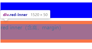
能看到 margin 的上下边距被控制在新的父元素中了。
当然我想说:你也可以将当前元素设置为 inline-block 触发 BFC ,只要符合规范都是可行的。
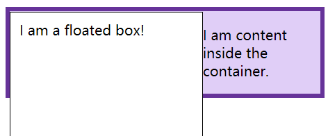
浮动元素丢失高度
我们知道设置浮动 float 属性的元素将脱离文档流,那么包裹浮动的父级元素的高度为其中非浮动的元素,甚至直接高度“塌陷”。
1 | <style> |
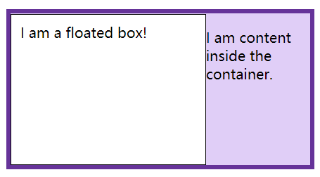
解决方式也很简单,参考上面的 margin 边距合并问题:我们也可以设置 overflow 来解决。
也可以设置 display: flow-root; 。
总结
文本章参考 MDN ,简单讲了下 css 中 BFC 的概念。
并且通过几个例子示范了如何处理元素间的常见问题( margin 边距合并、浮动高度丢失)。
当知道了 BFC 对元素之间的影响后,就能在页面布局中更好的隔离,或者处理元素间的关系。